


jamiejeanstewart@gmail.com


Research and planning
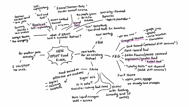
I first brainstormed a couple of ideas for what I should base my festival booth concept around. Would it be a brand new kiosk for an existing festival, or would I try to invent a completely new type of festival to theme it under?
Eventually, I landed on creating a brand new summer EPCOT festival! Knowing that, I thought about what kind of theme the booth should fall under. I could probably have gone in a couple of directions here, but “Cookout Cravings” really stood out to me as someone who grew up going on camping trips around the Midwest and attending summer camps in the Wisconsin north woods. That vibe was the epitome of summer for me.

Then, the research stage began. I also began to look at existing booths with similar aesthetics and pick out design language that I enjoyed from my references. PureRef was helpful in gathering all of this information in one place.

Kiosk layout
I knew that I couldn’t create a design without a base. I used my own firsthand experiences to map a kiosk layout that I personally thought worked best for both guest and cast member experiences. Since this was a hypothetical booth, I had no limits to the size, shape, or orientation of elements— but still kept it plausible and practical.

Once I found the layout that I liked the most, I re-taught myself SketchUp to create a plan view of the layout. I did this process in 3D so that I could extrude the bases later into the design process and draw over the 3D model to keep the size and scale accurate. I scoured the internet for the exact measurements so that I could keep things as close to reality as Imagineers would.

While doing my research, I came across the portfolio of Erin Rice, the designer behind the Alps kiosk. I was able to reach out to her and get advice on her process to incorporate into my own workflow. Her work has been an amazing reference point for me, so I have to give her a huge shoutout.
Graphic design
Originally, I wasn’t going to spend that much time on the signs and graphics, I was mainly going to focus on the kiosk design. But since I’ve done freelance graphic design work in the past, I figured that I might as well design a raster concept for the logo.


Once I got feedback from my fellow graduate friends from SCAD, I went through and fleshed out the final design using my chosen color palette.

Stock photo credits to: Paige Ledford, Ella Olsson, Daniel Lloyd Blunk-Fernández, and Sheri Silver.
I even went ahead and designed the menu that would appear on our Stark boxes. I was already having too much fun and it was an exciting challenge matching the style of the existing menus.

3D Modeling
I’m not a 3D modeler by trade, but I still wanted to challenge myself and create a nice base for my design to be drawn on top of. In the plan view that I had made with the free version of SketchUp, I extruded the base of the kiosk and used my researched measurements to build out the form.

Thumbnails
Using the 3D base, I sketched some possible variations using my moodboard as a reference.

Sketch
Going back into SketchUp, I snagged a slightly lower angle of the booth in 3D. With the help of my trusty panel of SCAD grad friends, I chose my favorite thumbnail and defined it with more detail.

Refining
I then refined my sketch further with some line art, using my sketch as a reference.

Color variations
I wanted to give myself a few color options to choose from, always going back to check their values in black and white. In the end, my friends and I really enjoyed the first one. I was most excited about it because those colors represent a quintessential north woods summer camp cabin color that’s very nostalgic to me.

Final image
Finally, with some rendering and pixie dust, our festival kiosk design has been brought to life!
References
I also wanted to make sure that I included my references for what inspired each part of the kiosk, so here I point to the specific images I took inspiration from to justify my design choices.
